CREATING FLYERS
Ready to send out flyers for your new listing, or one you just sold? Let's make sure it's done right, and doesn't end up in too many trash cans! For starters, you can create a flyer on www.canva.com for free by using one of their already made templates. I would start off with their templates but adjust colors and the location of text so it looks a lot more original to you, and to avoid using the same style anyone else may be using in your market, if they are working off of Canva, too. You can also have them professionally designed, but if you don't have the money to go this route, Canva is a great tool to get you started.
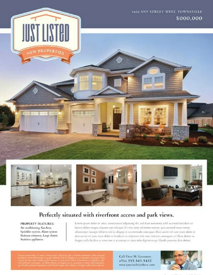
PERFECT, CLEAN & SIMPLE
OUT-DATED & MESSY
FLYER DO'S
Use high quality images.
Use 4 photos, front shot, kitchen, living room, and master.
List bedroom, bathroom, square footage.
List the price in bold.
Input the full address, street address on first line, city, state, zip on second line.
Keep the bio short and simple, but descriptive.
Make sure your call to action is strong. "Come to our open house," or "Call us to schedule a tour," etc.
Remember that less is always more in marketing.
Bullet point descriptions.
Make your contact info easily visible.
FLYER DON'TS
Do not use low quality photos, or photos that don't show the house in it's best light.
Don't use more than 4 photos, you want to give them a taste of the listing, but want to make them come over to look at more.
Do not put too many details, if there is too much to read, it'll end up in the garbage faster.
Don't send out a flyer with a lot of typos or grammatical errors.
Don't use more than two types of font styles.
Don't use hard to read fonts, use clean modern styles.
Don't use colors on the template that clash with the style of the home. Make sure it all matches.


